Haystock: quant methods to detect real-estate opportunities
A micro approach to investing in real-estate in NYC
TLDR / summary:
I created a Webapp where you can screen real-estate in NYC and find opportunities using a quantitative model I designed. I also provide a tool where you can dissect a building of interest, compare units through a wide range of metrics. This tool has helped several of my friends make better investment decisions (to purchase or turn down an investment).
Webapp link:
https://haystock-1.bubbleapps.io/
(Be patient with my AWS server things might take a few seconds to load… this is a pet project! — I wil)
What is Haystock
It all began with the realization that purchasing an apartment can either be a sentimental endeavor or a complex statistical problem.
I bought my NYC condo in 2015 thinking I had done enough analysis. I literally topped the market and lost 20% within 2 years.
During Covid, all my friends were saying how much real estate had tanked and how great of an opportunity it was for buying. I had some free time (I did some puzzles at night too) and decided to build a better tool to assess that claim. Haystock was born!
If you are an institutional investor you don’t purchase a “home”, you look for the most profitable commercial deals through very cynical lenses and optimize your portfolio creation. Most likely you have advanced models at your disposal and a team of data scientists to run them for you.
As a smaller investor, navigating the market and finding the best deals is much more grueling. You are most likely seeing the tip of the iceberg or the units your broker know. Besides, emotions might lead you to a bad deal (that might look good).
This is where Haystock also comes in. I want to provide you with top of the class data analysis to search through the market rationally. I am using advanced analytics to help you through that process while exposing the results in a language you can understand intuitively.
How does it work
Behind the scenes I have built a statistical model which estimates the price of every active listing.
At a high level the model operates as follows:
For a given unit (e.g The South Start #8I in the Financial District), we find a subset of “similar” units using a range of criteria such as price range, building type, level of amenities, year-built,…
We identify key variables which have a strong predictive power to estimate the price per square foot (ppsf) of a given unit. Examples of such variables are: the average of the ppsf for the subset defined above, rents prices net of taxes and charges, “quality” of the unit,…
The model leans on a multi-factor regression using those variables
A lot more work is done to clean up inputs such as sales prices, rent prices, taxes, charges. For example which rent price should you use if unit #1004 has never been rented out but you have data for unit #1003 and #1005 from 2y ago and 5y ago respectively. I might explicit my methodology in another post. In a nutshell, a lot of work has been done to generate clean(er) inputs that then feed into the model.
The screening tool
I like to have a visual interface. I represent each active listing with a color which represents how cheap or expensive the listed price is compared to my model estimated price.
If my model believes that the listed price is too low (high), it will highlight the unit in blue (red).
By playing with the inputs in the interface, you should be able to find needles in this giant haystack also called NYC!
One feature that is particularly useful is that whenever you click on a unit in the map, a detailed menu will show you pictures and key metrics underneath. Those key metrics can help you detect red flags very quickly.

In this example we see that the taxes and charges have skyrocketed. This requires a deeper analysis.
We can press the “Analyze Selected Unit” button to do just that.
Deep diving into a building
After pressing the button, you are taken to a new page which by defaults shows your the price evolution (in $ per sq ft) through time, highlighting #8I in yellow.

Let’s check the red flags we saw earlier: we are going to select Taxes & charges on the left panel and select the Rescale per sq ft option to normalize all units in the building.
The light blue dots represent the taxes, the darker blue dots the charges (the lines are the moving averages). It looks like since 2018 the charges have increased significantly. This is a red flag that requires a proper look at the building’s management to understand what happened.
I can guarantee you that few brokers would even know about that, let alone flag it.
There are a lot of other cool metrics you can play with. Let’s take a few examples.
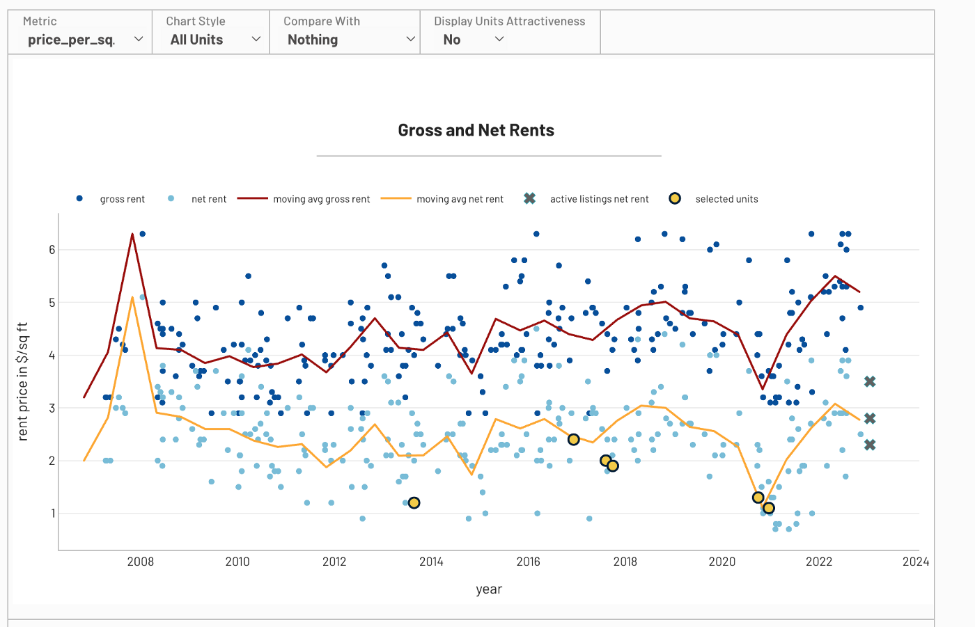
What are you taking home as a net rent (if you take away taxes and charges)?

Which units/floors are cheaper?
How much are you paying for a view?

how are the 3br pricing compare to the rest?
Next steps
This is a side project for now and I don’t spend as much time on this as I wish I could. There are some obvious improvements that can be done:
model refining and stability
expand the database
expand to other cities
enter new data types (more qualitative data about the units)
Conclusion
I believe that this tool can help users with their searches today. Using big data to screen for opportunities is what I do all day in finance. I strongly believe that we should use similar tools for our decision processes outside of finance too. This is one such example.
If you want to help improve this project or have any comment on the content, feel free to reach out.


